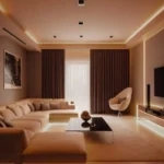
Choosing the perfect color palette for your living room is a critical step in setting the tone and style of your home’s central gathering space.
The right combination of colors not only enhances aesthetics but also influences mood, functionality, and cohesion with existing decor.
Whether you’re designing a cozy retreat or a vibrant entertainment area, selecting a palette that balances color psychology and design trends ensures lasting appeal.
From understanding the impact of lighting to aligning hues with furniture and accessories, this guide provides actionable tips to create a living room that reflects your personality while staying on-trend.
Let’s explore how to achieve a harmonious color scheme tailored to your unique space and needs.
Understanding the Basics of Color Theory
The Color Wheel
The color wheel categorizes colors into three main types:
- Primary Colors: Red, blue, and yellow.
- Secondary Colors: Green, orange, and purple.
- Tertiary Colors: Combinations like blue-green or red-violet.
Understanding how these colors interact can help you create harmonious combinations for your living room.
| Color Type | Description | Examples |
|---|---|---|
| Primary Colors | Cannot be made by mixing other colors. | Red, Blue, Yellow |
| Secondary Colors | Formed by mixing two primary colors. | Orange, Green, Purple |
| Tertiary Colors | Mix of primary and secondary colors. | Blue-Green, Red-Orange |
Warm vs. Cool Colors
- Warm Colors: Red, orange, and yellow evoke energy and coziness, making them ideal for social living rooms.
- Cool Colors: Blue, green, and purple create a calming, serene atmosphere, perfect for a relaxing ambiance.
Assessing Your Living Room Space
Room Size and Natural Light
The size of your living room and the amount of natural light it receives play a crucial role in color selection.
- Small Spaces: Light and neutral colors can make a room appear larger and airier.
- Large Spaces: Dark and bold hues add warmth and intimacy.
Furniture and Decor Compatibility
Evaluate the style and color of your existing furniture and decor. The goal is to create a cohesive look that blends the color palette with key elements such as:
- Sofas
- Curtains
- Artworks
- Area rugs
Choosing the Right Color Palette
Monochromatic Schemes
This approach uses variations of a single color for a sleek and minimalist look. For example:
- Light blue walls paired with navy-blue cushions.
Complementary Schemes
Complementary colors are opposites on the color wheel and create a vibrant contrast. For instance:
- Yellow and purple or blue and orange.
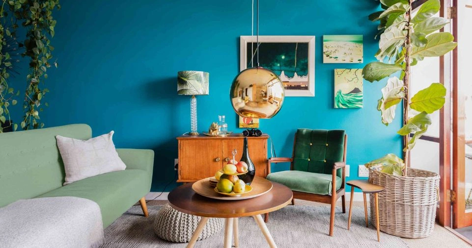
Analogous Schemes
Analogous schemes use colors next to each other on the color wheel. They produce a harmonious and cohesive look. Examples include:
- Green, teal, and blue.
The Psychology of Colors
Color has a profound impact on mood and perception. Here’s how popular colors influence your living room:
| Color | Psychological Impact | Best for Living Rooms With… |
|---|---|---|
| Blue | Calm, serene, and relaxing. | Minimalist or coastal themes. |
| Yellow | Cheerful, energizing, and bright. | Smaller rooms needing warmth. |
| Green | Balanced, fresh, and natural. | Biophilic or eco-friendly designs. |
| Neutral Tones | Versatile, soothing, and timeless. | Modern, Scandinavian, or transitional styles. |
| Red | Energetic and bold, promotes conversation. | Social or eclectic living rooms. |
Current Color Trends for Living Rooms
Earthy Tones
Earthy colors like terracotta, olive green, and beige are trending for their connection to nature.
Dual-Toned Walls
Pairing two contrasting shades—like navy blue and soft gray—adds depth and character to a living room.
Moody Shades
Deep, moody colors like charcoal and emerald green are increasingly popular for creating a luxurious feel.
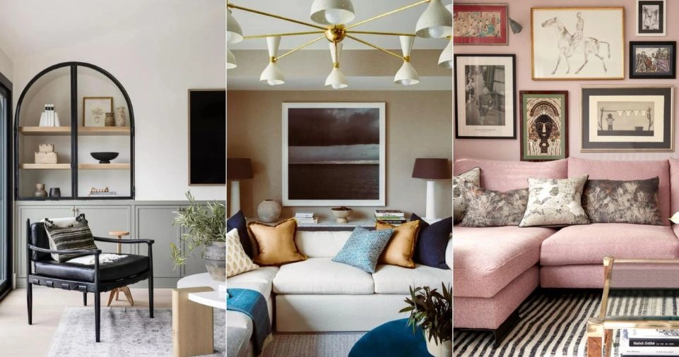
Incorporating Patterns and Textures
Adding patterns and textures can enhance your living room palette:
- Textured Walls: Use faux finishes or wallpapers for a dramatic effect.
- Layering with Rugs and Pillows: Combine solids with patterned textiles for a dynamic look.
Practical Steps to Finalize Your Palette
Use Paint Samples
Always test your chosen colors on a small section of the wall before committing. Observe how the colors change throughout the day with different lighting conditions.
Follow the 60-30-10 Rule
This rule ensures balance and harmony:
- 60%: Dominant color (walls).
- 30%: Secondary color (furniture).
- 10%: Accent color (decor and accessories).
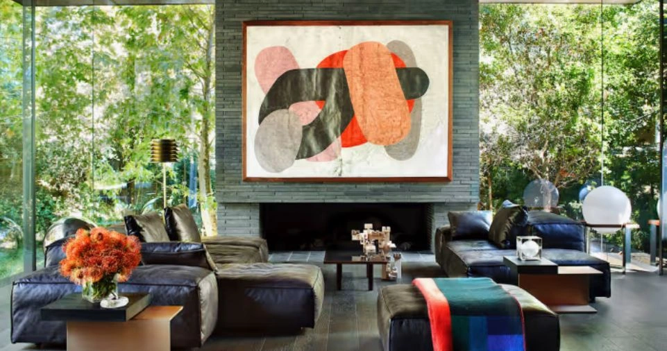
Be Inspired by Art and Nature
Draw inspiration from a piece of artwork or natural surroundings to create a palette that resonates with you.
Common Mistakes to Avoid
- Ignoring Lighting: Poor lighting can make even the best colors look dull.
- Overwhelming Patterns: Stick to one or two patterns to avoid a chaotic look.
- Not Considering Maintenance: Lighter walls may require frequent cleaning in high-traffic areas.
Example Color Palettes for Living Rooms
| Palette Name | Primary Color | Secondary Color | Accent Color | Suitable Style |
|---|---|---|---|---|
| Modern Minimalist | Soft Gray | White | Black | Scandinavian or Contemporary |
| Coastal Retreat | Light Blue | Sandy Beige | Coral | Coastal or Beach-Inspired |
| Rustic Charm | Terracotta | Olive Green | Cream | Farmhouse or Rustic |
| Luxurious Lounge | Emerald Green | Charcoal Gray | Gold | Glamorous or Sophisticated |
Conclusion
Choosing the perfect color palette for your living room is a blend of science and art.
By understanding color theory, evaluating your space, and experimenting with trends, you can create a living room that’s not only visually stunning but also a reflection of your personality.
Remember, the right colors can transform your space into a sanctuary of style and comfort.
FAQs
How many colors should I use in a palette?
Stick to three main colors (dominant, secondary, and accent) for a balanced and cohesive look.
What’s the best way to choose a color scheme?
Start with your favorite color, assess your space and decor, and use tools like color wheel apps for inspiration.
Can I mix warm and cool tones?
Yes, mixing warm and cool tones can create an interesting and dynamic look. Just ensure they complement rather than clash.